
Article Updated June 1, 2023
Prime Time
In the world of custom label printing, there are many different names for the same thing. You may have heard the terms “underprinting”, “base white”, or “underwhite.” In our neck of the woods, we call it “spot white.”
In the simplest terms, spot white is a primer layer of white that prints first before your cyan, magenta, yellow, and black. This primer layer of white acts as a barrier between your design and the base material which gives us a blank canvas to print on.
Keeping it Bright
Dig way deep into your childhood memories and imagine for a moment that you’ve just opened a brand new box of jumbo Crayola markers. That yellow marker looks bright and fun and catches your eye. You take it out and draw a friendly sun shining on your white sketchpad. That blank white canvas really allows the yellow to stand out from the page.
What if you were drawing on a brown piece of Kraft paper? Same marker, same sun. However, you would most certainly see a different work of art. That yellow wouldn’t appear nearly as bright or vibrant.

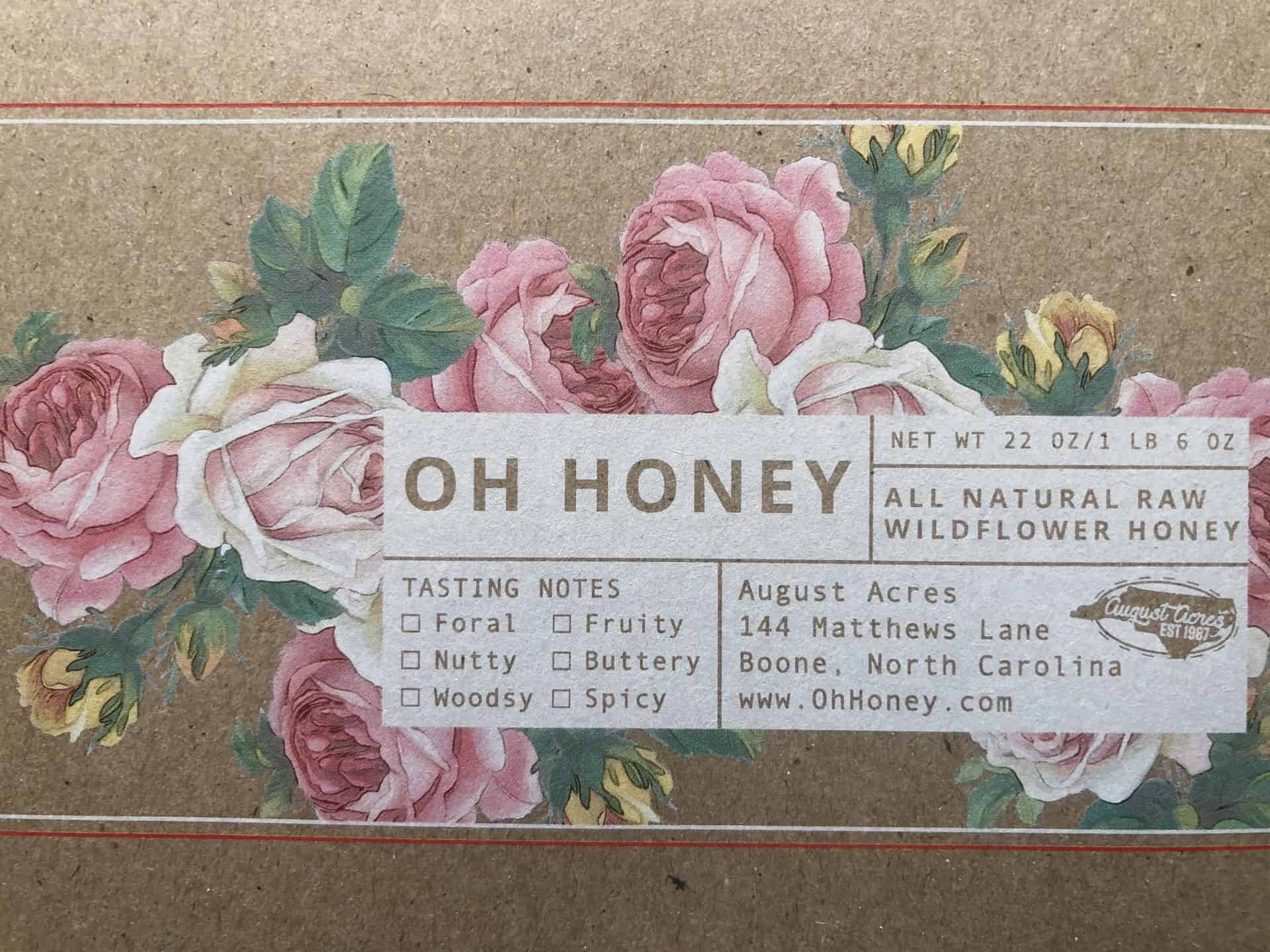
Notice the roses on the left side, the inks appear less vibrant since they are printed directly onto the kraft. The same roses are on the right, but a primer layer of spot white has been printed first making the inks pop. No spot white and spot white offer two completely different looks even with the same artwork.
The same principles apply in digital printing! If you are printing on a White material—like White Paper or White Plastic, you do not need that primer layer of white. However, if you are using a colored base material like Kraft Paper or Black Vellum, you will certainly need a layer of spot white printed underneath to help your colors stand out.
A Jack of All Trades…
Pro Tip: The need for this spot white barrier also comes into play when you are printing on Clear, Metallic, and Holographic materials.
With clear or transparent labels, spot white keeps your design opaque and helps your colors maintain vibrancy. Without that layer of white underneath, the surface that you’re applying to shines through and washes out your carefully designed colors! If you do not want the colors of your packaging or your product to interfere with your design, you definitely need some spot white.

The cherries on both labels do not have a layer of spot white behind them; however, once a white piece of paper is put behind the cherries, they appear more vibrant…this is the concept of spot white.
With our Metallic and Holographic materials, the raw material is actually shiny silver. Anything printed directly onto the silver will still allow the metallic effect to shine through. However, you may not want the entire label metallic! Metallic sometimes looks best with minimal accents. This is where spot white comes in handy. Spot white acts as a barrier to block out the metallic effect entirely. This will allow you to control which areas you want metallic, and which areas you want non-metallic.

Build A Spotwhite Layer
When setting up your artwork, you should include a separate layer called the spotwhite layer. The spotwhite layer tells us which areas you want to be opaque and which areas you want to have your chosen effect, whether that be Metallic, Clear, Kraft, etc. Read the instructions below and follow along with our step-by-step video to learn how to make your spotwhite layer.
If you’re using Photoshop to create spotwhite, watch our tutorial video here.
- Duplicate your artwork layer and rename it “spotwhite.” This layer should be at the top of the list in your Layers window.
- Create a new swatch in the Swatches window. Name the swatch “spotwhite” and change the color type from process color to spot color. Set the ink to only 100% magenta.
- Elements that need white ink printed, whether to be white or to be opaque, must be set at 100% spotwhite. Elements with no white ink printed (areas you want to appear transparent, metallic, etc.) must be set at 0% spotwhite. Every element on the spotwhite layer must have the spotwhite swatch, either at 100% or 0%.
- After spotwhite is applied to all elements, use select all to select everything on the layer. Open the Attributes window and check that Overprint Fill is checked on everything. If the option for Overprint Stroke is available, be sure to check that option also.
- To check that the Overprint attributes and spotwhite are correct, go to the View menu and select Overprint Preview. You should be able to see your artwork through the spotwhite layer. Check to make sure everything is lining up well.
Additional Notes
- You can also reference these instructions for cartons. Use the instructions above for files built in Adobe Illustrator. If you’re using Photoshop, check out our step-by-step video for spotwhite creation using that particular program.
- If you are not sure how to set up your file or if you have questions about what you might need, please reach out to us. Any one of our Customer Care Team members would be happy to answer your questions and give you some suggestions. As always, happy printing!


