
The UPS truck just dropped off your first box of custom labels! Inside the box are hundreds of brand new labels that you spent hours designing, pouring over the color scheme, and listing each and every ingredient with meticulous dedication. You pop open the box and take out a roll of labels to admire your handiwork. The logo looks great, the color looks good, but wait… the text is way too tiny to read, and everything else is a blurry, illegible mess. You stare at your labels in utter disbelief.
And then you wake up! It was only a bad dream… but what if it were real?
The nightmare of illegible text does not have to be a reality! Several factors play a part when it comes to pixelated, blurry, unreadable text, and they all originate in the design stage. Check out the tips below to make sure all your tiny text comes out beautiful and legible, like the ones used for Lindbergh Candles.
File Type
First, check your file type. If it originates in a vector-based program, such as Adobe Illustrator, you’re already one step ahead of the game! We strongly recommend only using vector file types for print (.ai, .pdf, .eps). We’ve said many times that vector files typically lend themselves to the best print quality, and this is especially true if you have lots of text on your label. Text in vector-based files remain sharp and crisp because they are made up of geometric lines instead of pixels.
Check out this screenshot of some text we’ve typed in Illustrator.
If your design originates from a raster-based program like Photoshop, don’t worry. Your file will still print well as long as you keep all or most of your design elements in separate layers and your resolution set to 300 dpi at the least, 800 dpi at the most. Resolution lower than 300 dpi will yield a blurry print.
Check out this screenshot of some text we’ve typed in Photoshop.

Font Size
The size of your font also contributes to legibility. For dark font on lighter backgrounds, 5 pt font is the minimum we recommend printing. Anything smaller than 5 pt will be extremely difficult to read, unless it’s all capitalized. Even then, 4 pt font is about the smallest you can go. Keep in mind that some typefaces have thinner or lighter font weights, so just because one font is legible in 5 pt doesn’t necessarily mean another one will be.
If you have light text on a dark background, the parameters are tighter. Keep font size around 7 pt or larger, especially if it is very thin.
Pro-tip! The font weight can also play a part in print quality. If your font is 5 pt and super thin, you may be walking a fine line.
Font Color
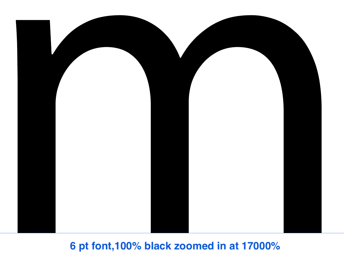
Black is black, right? Wrong! If your text is black, we highly recommend that it be only 100% black or key (the K in CMYK). If it is a color build of black, the printer will use dots of all the CMYK inks that are spread out on the paper, which doesn’t form a totally seamless line of text. Many times, your text will look “pixelated” because of this. If your font is set up as 100% black, the printer will print only black ink in a smooth, seamless stroke, resulting in crisp text.
If you want a pop of color, that’s fine too! Keep in mind that lighter colors will be hard to read if they’re printed on a light background. You may even want to bump up your font size to 7 pt or larger to make sure everything stays legible.
Pro tip! For colorful text, having one element of CMYK as close to 100% as possible can significantly improve clarity.
Check it out! Print off this PDF at 100% scale to see a few examples of text size and color and how they appear in print.
To The Press!
If you’re ever in doubt about whether or not your text will be legible, print your design(s) off on your home printer. Remember to select either 100% scale or “Do Not Scale” (if you’re printing from an Adobe program) so the design will print true to size. If you can read all text easily, it’s a good sign your labels are good to go. Our team is always happy to double-check your fonts for you, so feel free to drop us a line and ask us to take a look!
You might also like:


